
Many a CMO has pondered whether the time is right for a brand in their portfolio to undergo a makeover. 109-year-old brand Chicken of the Sea just embarked on its first in 20 years – so why now? Let’s examine its transformation to consider the functional and esthetic “whys” behind the new work.
First, what did they refresh? Of course a brand is much more than a logo, so the team also tackled the positioning, packaging and launched a new campaign.
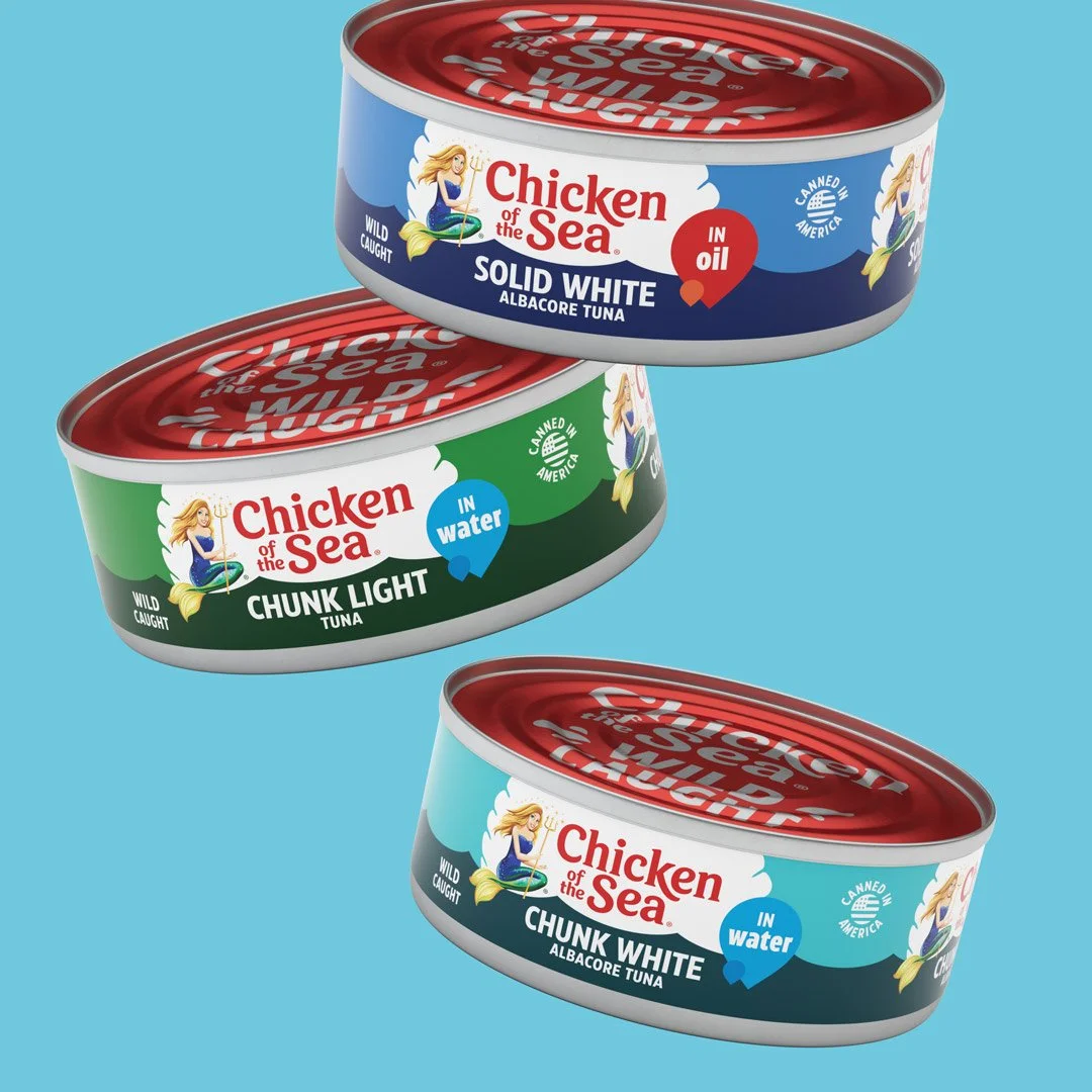
Most consumers will encounter the brand in only one place – their supermarket shelf. So legibility and shopability are of utmost importance, even more so when considering the small size of a tuna can.
The logotype was separated from the brand mascot so the words can more easily be scaled, and the font was refreshed to be bolder, cleaner and more modern. Losing the drop shadow also improves readability, especially on screens.
Of course it’s important to also remain true to the known look with a legacy brand, so the prominent red and green brand palette was retained, but the colors are now more saturated. And the background on the can was simplified from a color-gradient burst to a clean white graphic resembling a clam shell that evokes the ocean.

And in the smartest functional move in my opinion, the logo treatment is replicated on the back and front of the can, so it’s visible to matter how the cans are stacked on shelf.
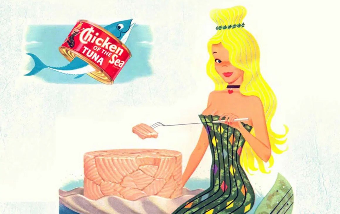
The brand mascot, mermaid “Catalina,” has been separated from the logotype, giving her a more prominent position. Luckily Chicken of the Sea didn’t have to contend with the old version being culturally insensitive like other recent troublesome brand refreshes (however scroll to the end to see the original 1952 character.) The tweaks are subtle, but meaningful. According to the brand and its agency partner, the goal was to make her look stronger, more confident and less cartoonish.
They gave her expression more definition and straightened her posture toward the viewer to convey more empowerment. And now she wields Poseidon’s trident instead of a small scepter.
In terms of positioning, the brand tightened its promise to consumers - that they can “eat healthy and live happy,” which ladders to that of its parent company Thai Union’s: “Healthy Living, Healthy Oceans.”
Utilizing consumer research, its claim of “wild caught” was given much more prominence on the cans, including on the real estate on the top of the can. And it was carried into the new advertising campaign’s tagline, ‘Wild-Caught Happiness.’
And what’s a campaign launch without a promotion? Chicken of the Sea ran a cute “mermaid-spotting” social content to engage consumers with the brand.
So, whether for functional or esthetic reasons, are you ready for a refresh?
Sources: