


Obviously, when you change your name, there’s re-branding involved. So voila: A BarberWarren logo spanning a spectrum of color, based on our initials, an = sign reflecting our model and collaborative spirit and a logo that, when flipped, says “We”. (Yeah, so maybe not intentional, but hey, we own it.)


Here’s a challenge. The logo needs to say the company is in the home renovation business. And reflect the initials of the siblings who make up the name Madkats. Oh, and by the way, the company is smart, friendly and easy to do business with. Purrrrr.
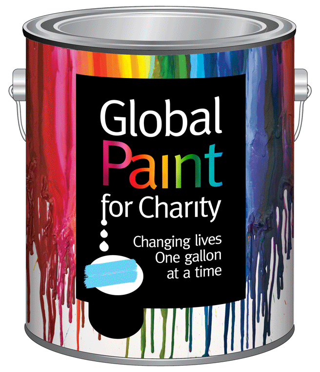
This award-winning logo is part of a total identity and packaging assignment. Pro bono client Global Paint for Charity collects used, even dried up paint, then converts it into gallons of paint in bright, individual colors that bring joy and pride to impoverished communities worldwide.

What else do you do in Cabo besides have fun, eat and drink margaritas? Drink enough, we guess, and you’ll see monkeys drinking with you. But why wait to go back? You’ve got Cabo Cantina right here.

This was truly a start-up experience considering we started with nothing in the way of branding. Not even a name. So we branded them DV8 Sports, as everything they make and do for golf deviates from the norm.


We designed their club faces and unique “golf bag” that even housed a stand and iPad for instructional videos by legendary instructor to the pros, Rick Smith. Who, by the way, was effusive in praising a clubhead design where the logo also served as a swing-path guide to the “sweet spot” of the club.

Next came the packaging design for junior clubs that deviated even more from norm. Buy a box at retail or online that provides an easy-to-order set of “custom” clubs. A box that contains a more economical grow-with-you system that eliminates having to play with outgrown clubs or purchase new clubs every year. EPEC to say the least.

This is a game changer of an idea. One that created a whole new category of wearable, multi-functional lighting. So after naming and logo design, first up for packaging: look like it. Give it a shape and form that screams different and shows off the product. Then give it a look that stands out from the sea of red and yellow competitors. Oh, and provide a telegraphic on-package demonstration of all that Morph™ Removables can do. Tall order? Not if sales have anything to say about it.